Visual Identity & Design
Good player education should be as readable and carefully designed as the rest of your communications. This module covers the adaptive identity model, the different visual treatments for Tier 1 and Tier 2, and the WCAG 2.1 AA accessibility requirements used in the brand system.
Operator note: Replace
{{PROGRAM_NAME}}with your program name throughout. The default palette, type system, and tier rules are part of the brand system and should not be modified. What you do customize — your colors, your fonts, your logo — is exactly what the adaptive identity model is built to let you change. Narrator scripts should be recorded in the Playbook Tier 1 voice unless a section is marked Tier 2.
Program: Brand Foundations | Duration: ~20 min | Prerequisites: RG Foundations
Quick-scan index
| Section | What it covers | Time |
|---|---|---|
| Learning objectives | What you’ll know after this module | — |
| Section 1: Visual System Principles | Adaptive identity, color, type, icons, photography | ~7 min |
| Section 2: Tier 1 vs Tier 2 Visual Rules | How the two tiers look different, the four-point ship test | ~7 min |
| Section 3: Accessibility Requirements | WCAG 2.1 AA baseline, dark mode, the pre-ship checklist | ~4 min |
| Module test | 5 graded questions, 80% to pass | ~2 min |
| Key takeaways | Summary | — |
| References | Links to Playbook brand assets | — |
Learning objectives
After completing this module, you will be able to:
- Use the adaptive identity model to brief a designer on a new operator deployment
- Apply Tier 1 vs Tier 2 visual rules to any piece — including the cases where they shift mid-flow
- Verify WCAG 2.1 AA compliance for contrast, touch targets, and font choices on real artwork
Why this matters: You’re the one signing things off. A designer can build a beautiful card, but if it ships with a failed contrast ratio or a stray bit of orange in a crisis screen, that’s on the reviewer — and the reviewer is you. This module gives you the rules to make those calls fast and defend them when someone pushes back.
Think about this: Picture the last responsible-gambling notice you saw — a footer link, a warning box, a leaflet by the door. Did it look like it belonged to the brand around it, or did it look bolted on? Hold that picture. By the end of this module, you’ll know exactly what’s wrong with it.
Section 1: Visual System Principles
Reading
Most responsible gambling content looks like it was designed by a compliance department. Usually because it was. {{PROGRAM_NAME}} does the opposite. Player education should be visually indistinguishable in quality from the operator’s commercial content.
The visual quality rule: {{PROGRAM_NAME}} content must match the production quality of the operator’s commercial marketing. If it looks generic, players treat it like fine print.
The adaptive identity model. {{PROGRAM_NAME}} combines a shared structure with each operator’s identity:
- Operators customize the color palette, heading and body fonts, logo and co-branding, and photography style.
- The system preserves layout and spacing, information hierarchy, the dual-weight icon system, and component structure.
The result is recognizable without being identical: players can recognize the structure across operators, even when the colors and fonts differ.

The default palette. {{PROGRAM_NAME}}‘s default colors are chosen to feel like a lifestyle brand, not a health program. There are three brand colors. Deep navy (#1B2838) is the primary — headers, backgrounds, identity. It reads as authority and sophistication. Emerald (#10B981) is the secondary — interactive elements and highlights. It reads as energy and modernity. Bold orange (#FF6B35) is the accent — CTAs and attention. It reads as action and urgency, and it appears in Tier 1 only.
- Deep navy #1B2838Primary — headers, backgrounds, identity.
- Emerald #10B981Secondary — links, highlights, actions.
- Bold orange #FF6B35Accent — Tier 1 only. Gone in Tier 2.
- Surface #F5F5FAThe light ground most layouts sit on.
- White #FFFFFFCards and panels. Navy on white = 14.9:1.
Semantic colors are separate, and they’re functional. Alongside the brand colors sits a small set of state colors: success (#00C853) for a quiz passed or a limit set, warning (#FFB300) for approaching a limit, danger (#FF3D00) for Tier 2 crisis only, and info (#2979FF) for tips and explainers. Keep these standard even when you customize everything else. Players learn these associations across every product they touch. Your brand colors express identity; semantic colors express function. Mix the two and you lose the signal — a red CTA button next to a red danger alert stops meaning anything.
Typography uses three fonts, each with a job. Inter carries headings and UI — headlines, section headers, quiz questions, CTAs, the wordmark. Source Sans 3 carries body text — paragraphs, descriptions, form labels. Source Code Pro carries data and helpline numbers — odds, RTP values, phone numbers. That last choice is functional, not decorative: Source Code Pro makes 0 and O, and 1 and l and I, visually distinct. When someone is trying to reach a helpline, telling those characters apart can be the difference between getting help and dialing a wrong number.
Iconography pairs bold structure with light detail. The brand frames open, approachable content in a confident structure, and the icon system expresses that with two stroke weights: 2px primary strokes for outer shapes and structure, 1px detail strokes for inner accents. That 2:1 ratio builds hierarchy inside each icon and keeps the whole set reading as one system. The library covers 31 icons across six categories: game types, odds and math, player tools, content and education, social and sharing, and support and safety.


Photography should feel like lifestyle editorial. Candid, well-lit, real people, cinematic mood. The test question for any image: does this make gambling look like fun entertainment among friends, or like an isolated, high-stakes activity? Reach for warm directional light, real people, close-up detail, the player’s own point of view. Avoid dim, moody lighting that feels isolating, and avoid generic stock filler with no people and no story. One hard rule on top: never set white text directly on an unprocessed photo. {{PROGRAM_NAME}} places text over a gradient overlay so contrast always holds — navy for most treatments, teal for positive and action-oriented messaging, navy with an orange accent for myth-busting.
Narrator Script
Narrator: [transition slide] {{PROGRAM_NAME}}‘s visual system starts with three brand colors. Navy is the primary — trust and authority. Emerald is the secondary — interactive elements, links, calls to action. Bold orange is the accent — energy for Tier 1 material, and it disappears completely in Tier 2.
[show three-color palette] Sitting beside those is a separate set of semantic colors — success, warning, danger, info. Keep those standard even when you change everything else, because players learn them across every product they use.
[show type system] Three fonts, three jobs. Inter for headings, Source Sans for body, and Source Code Pro for helpline numbers — because it keeps a zero from looking like an O when someone needs to dial for help.
[show iconography] The icon set carries the same idea: two stroke weights — bold structure, light detail — one consistent library across every operator.
[pause 3s] The whole system is deliberately restrained. Visual noise is the enemy of player education.
Section 2: Tier 1 vs Tier 2 Visual Rules
Reading
Quick recall from RG Foundations. Tier 1 is the routine education register — entertainment literacy: confident, witty, brand-forward. Tier 2 is the support and crisis register: warm, direct, zero humor. RG Foundations covered how each tier sounds. This section covers how each one looks.
Both tiers use the same design system. The difference is how much of it you turn on.
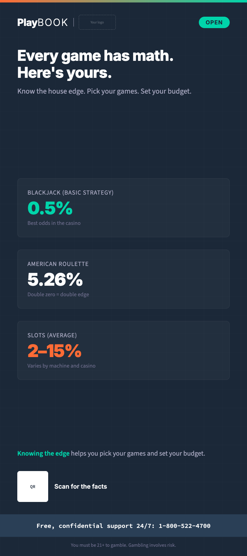
Tier 1 is entertainment literacy. It’s the majority of {{PROGRAM_NAME}} output, and it should be engaging, dynamic, and brand-forward — full palette, rich layouts, photography, animation, personality. Look for the shared DNA: navy backgrounds, teal accents, Inter headings, the PlayBOOK wordmark, orange for attention. Tier 1 templates run across social cards, stories, posters, emails, venue signage, rack cards, and digital displays. Each one is built to compete with the operator’s best commercial content.
Tier 2 is support and crisis, and restraint is the whole point. The design goal is zero friction — nothing competes with the support information. So you strip back to essentials: maximum contrast, no decoration, minimal color, large touch targets, single column. And Tier 2 always renders in light mode, even if the player has dark mode on, because dark mode can feel isolating in a crisis. Here’s the contrast at a glance: where Tier 1 uses the full palette, Tier 2 uses neutrals plus teal only. Where Tier 1 varies type weights freely, Tier 2 stays large, clear, and flat. Where Tier 1 builds dynamic grids and cards, Tier 2 is a single column with generous spacing. Where Tier 1 leans on photography, illustration, and data viz, Tier 2 carries no imagery at all — text and links only. Tier 1 invites interaction through quizzes, tools, and animation; Tier 2 offers simple buttons and nothing else.
See the difference side by side:
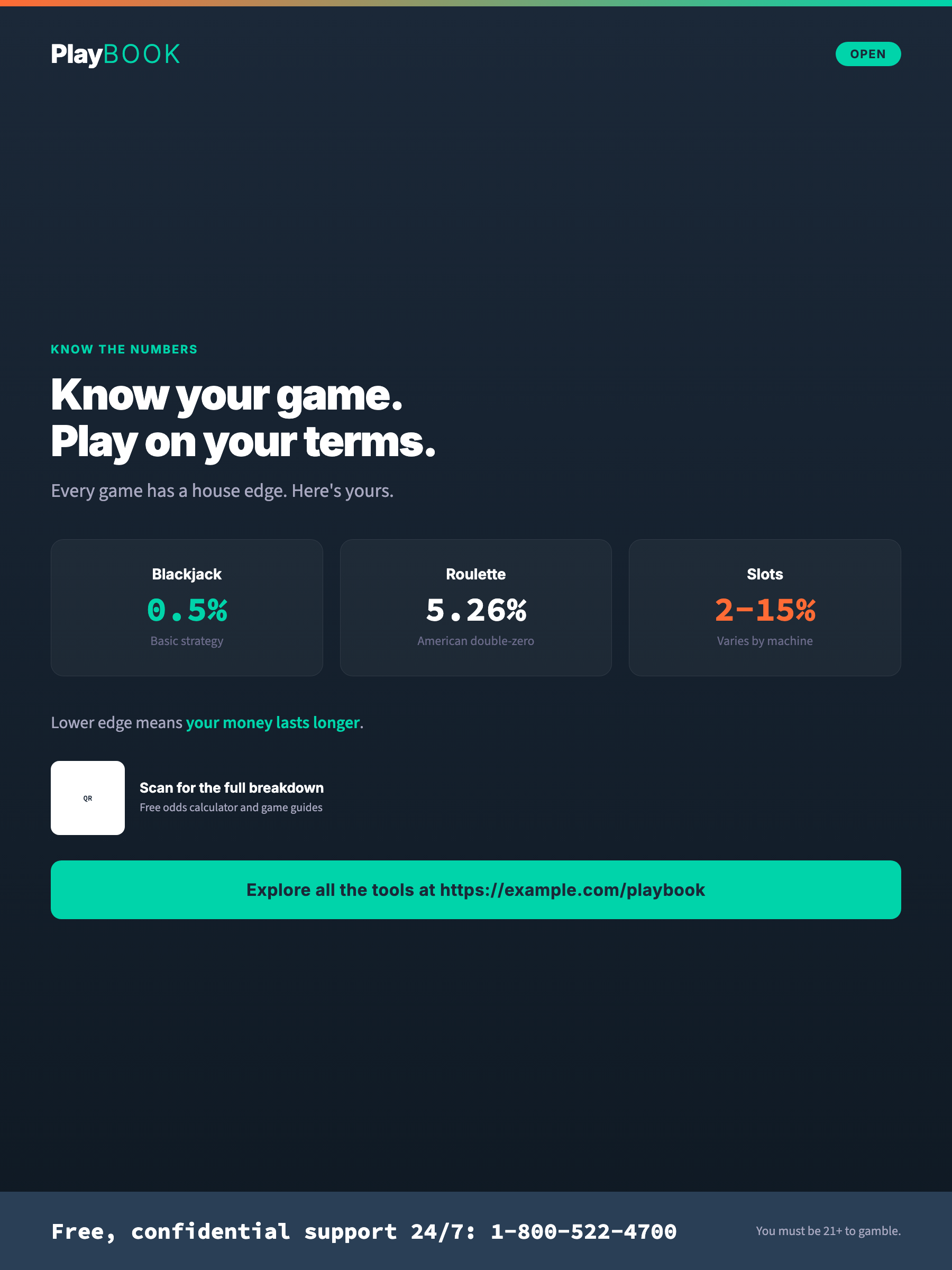
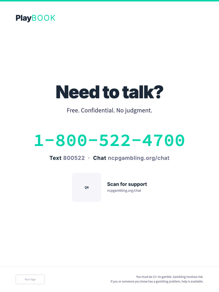
Both tiers use the same brand quality. The difference is restraint, not quality. Tier 2 isn’t “uglier Tier 1” — it’s deliberately sparse, because visual noise is friction when someone needs help.
The four-point integration test. Before you ship any {{PROGRAM_NAME}} piece, run it past four questions. Pass all four and it ships. Does it belong? Put it next to the operator’s commercial content — does it look native, or bolted on from a different brand? Would a CMO sign off? If it looks like compliance made it, send it back; the bar is marketing-quality, not regulatory checkbox. Does it feel modern? If it could have been designed in 2010, it’s not good enough — players consume cutting-edge content all day. Is it accessible? Run the contrast ratios, check the touch targets, test it with a screen reader. Accessibility is a prerequisite, not an afterthought.
Narrator Script
Narrator: [transition slide] Tier 1 and Tier 2 use the same brand quality. The difference is restraint, not quality.
[show tier 1 sample board] Tier 1 gets the full visual system. Navy backgrounds, teal accents, bold orange highlights, playful icons, branded illustration. This is where the personality lives.
[show tier 2 sample board] Tier 2 strips it back. Orange disappears. Decoration disappears. The palette drops to neutrals plus teal for essential actions. Layout goes single-column, white space opens up, and Tier 2 always renders in light mode — even if the player has dark mode enabled.
[pause 3s] When someone needs help, every extra visual element is friction.
Section 3: Accessibility Requirements
Reading
Accessibility isn’t a nice-to-have. If a player can’t reach your content because of a disability, a device limit, or a situation like bright sunlight or a noisy venue, your education fails them the same way buried compliance text does. Different barrier, same result: the player doesn’t get the information they need.
WCAG 2.1 AA is the baseline. Every {{PROGRAM_NAME}} touchpoint should meet it. In practice, that’s a short list of numbers you can check. Contrast for text must hit 4.5:1 for normal text and 3:1 for large text — every foreground-on-background combination has to be measurably readable. Contrast for UI — buttons, icons, charts, controls — must hit 3:1 against their background. Touch targets must be at least 44x44px so every button, link, and field is easy to tap. On top of the numbers, three structural rules: everything works by keyboard (sensible tab order, visible focus, no traps), everything is legible to a screen reader (semantic HTML, ARIA labels where needed), and body text is at least 16px. No exceptions on that last one — content people are meant to read has to be readable.
To make those ratios concrete: white on navy is 14.9:1 and passes easily. Emerald on navy is 5.9:1 and passes. Navy on white is 14.9:1 and passes. Light text on a light background lands around 1.4:1 and fails — which is exactly the kind of thing a quick check catches before it ships.
Dark mode has its own traps. Muted text is the big one: neutral_500 (#6B6B8A) on neutral_900 (#1A1A2E) is only 3.33:1, which passes for large text but fails for normal text — so use it sparingly, and only at 18px+, or 14px+ bold. For status colors, always use dark text on the chromatic backgrounds (success, warning, danger, info), in both light and dark mode; never white. Knock image brightness down to 85-90% so photos don’t glare on dark backgrounds. And remember the rule from Section 2: Tier 2 pages always render in light mode.
Operator integration point: Run this checklist before any piece ships. Visual and contrast — every text/background combination meets 4.5:1 (normal) or 3:1 (large); all interactive elements are at least 44x44px; no meaning is carried by color alone (back it up with text, icons, or pattern); helpline numbers are set in Source Code Pro with 0/O and 1/l/I confirmed distinct. Interaction and devices — every action works by keyboard; the content makes sense read linearly by a screen reader; every image has alt text (descriptive for informational, empty for decorative); the layout has been checked on mobile, tablet, desktop, and assistive devices. Your organization may also have its own accessibility policy or legal obligations on top of WCAG. Link them here: Internal Policies
Narrator Script
Narrator: [transition slide] Accessibility isn’t optional. It’s the foundation of inclusive player education.
[show WCAG checklist] Color contrast meets WCAG double-A — four-point-five to one for body text, three to one for large text. Touch targets are at least forty-four pixels. Every layout works by keyboard and reads cleanly to a screen reader. Never use color alone to carry meaning. Every image gets alt text. And Tier 2 always renders in light mode, because dark mode can feel isolating in a crisis.
[pause 3s] The goal is simple: every player, whatever their ability, can reach every piece of material.
[transition to exercise] Before the test, six design calls are waiting on your desk. For each one, decide: ship it, or fix it. Every answer comes straight from the rules you just learned. Work through them, then continue.
Exercise: Ship It or Fix It?
Type: scenario
Instructions: Six pieces of player-education artwork are on your desk for sign-off. For each one, decide: does it ship as-is, or does it go back to design? Judge it against the rules from this module — the visual quality rule, Tier 2 restraint, semantic colors, and the WCAG 2.1 AA floor.
| Item | Correct Category | Feedback Correct | Feedback Incorrect |
|---|---|---|---|
| A Tier 1 social card busting the “hot machine” myth: navy background, teal highlights, a bold orange CTA, an editorial photo of friends at the bar — headline set on a navy gradient overlay. Contrast checks pass. | Ship it | Correct — this is Tier 1 doing its job. Full palette, personality, marketing-grade photography, and the headline sits on a navy gradient overlay instead of raw photo, so the text-over-photo rule and WCAG contrast both hold. | This one is clean. Tier 1 gets the full visual system — orange included — and the headline sits on a navy gradient overlay, which is exactly how {{PROGRAM_NAME}} keeps text over photography at WCAG AA contrast. |
| A “Know the odds” rack card built from a free stock template: gray system fonts, clip-art dice, no brand elements — sitting in a holder next to the operator’s glossy promo cards. | Fix it | Correct — this violates the visual quality rule. {{PROGRAM_NAME}} content must match the production quality of the operator’s commercial marketing. If it looks like compliance made it, players will treat it like fine print. | Put it next to the promo cards and it fails the first question of the integration test. The visual quality rule says player education must match commercial marketing quality — a clip-art stock template doesn’t come close. |
| A take-a-break confirmation page with a bold orange “Confirm” button, a celebratory confetti illustration, and a layout that follows the player’s dark-mode preference. | Fix it | Correct — three Tier 2 violations on one screen. Orange disappears in Tier 2, decorative elements disappear, and Tier 2 always renders in light mode because dark mode can feel isolating in crisis contexts. Strip it back to neutrals plus teal. | This is Tier 2 territory, so the restraint rules apply. Orange disappears, decoration disappears, and Tier 2 always renders in light mode regardless of system preference. Visual noise is friction when someone needs help. |
| A Tier 2 support page: single column, neutrals plus teal only, no imagery, large tappable buttons — and it renders in light mode even for players with dark mode enabled. | Ship it | Correct — this is textbook Tier 2 restraint. Neutrals plus teal, single column, zero decoration, light mode locked. Nothing competes with the support information, which is the whole point. | Sparse is not broken — it is deliberate. Tier 2 strips back to essentials so nothing competes with the support information, and forcing light mode is the rule, not a bug. This one ships exactly as designed. |
| A mobile odds quiz with crisp contrast throughout — but the answer buttons measure 36x36px so more options fit on screen. | Fix it | Correct — those buttons fail the touch-target floor. WCAG 2.1 AA requires a 44x44px minimum for every interactive element, and 36px misses it. Passing contrast doesn’t buy back a failed tap target. | Check the touch targets. WCAG 2.1 AA requires a 44x44px minimum for every interactive element, and these buttons are 36px. Great contrast doesn’t excuse it — fix the buttons, then ship. |
| To make the palette feel cohesive, a designer restyles the “limit set” success state in the operator’s brand orange and the approaching-limit warning in brand navy. | Fix it | Correct — semantic colors are functional, not decorative. Success, warning, danger, and info stay standard across every product and platform. Players learn these associations; repainting them in brand colors destroys the signal. | Brand colors express identity; semantic colors express function. The success/warning/danger/info palette stays standard even when everything else is customized — a warning dressed in brand navy stops reading as a warning. |
Module Test
Narrator: [transition slide] Time to check what you’ve learned. Five questions, covering the visual system, the Tier 1 and Tier 2 visual rules, and the accessibility floor. You need 80% — that’s four out of five — to mark this module complete. Take your time. If you don’t pass on the first try, you can review the material and retake the test.
Question 1
Assesses: Learning objective 1
Stem: What is the “visual quality rule” for {{PROGRAM_NAME}} content?
| Option | Text |
|---|---|
| A | {{PROGRAM_NAME}} content should use a distinct, clinical aesthetic to differentiate it from commercial content |
| B | {{PROGRAM_NAME}} content must match the production quality of the operator’s commercial marketing |
| C | {{PROGRAM_NAME}} content should be minimalist so it doesn’t compete with the operator’s brand |
| D | {{PROGRAM_NAME}} content should follow government health communication design standards |
Correct: B
Explanation: If the {{PROGRAM_NAME}} content looks generic, dated, or lower-quality than the promotional content around it, players will treat it like fine print. Design it like you’d design a product launch — because that’s what it is.
Source: Visual System
Question 2
Assesses: Learning objective 1
Stem: What is the “adaptive identity model”?
| Option | Text |
|---|---|
| A | A system where {{PROGRAM_NAME}} looks identical across all operators |
| B | A system where operators keep {{PROGRAM_NAME}}‘s structural identity (layout, hierarchy, icons) but apply their own colors and fonts |
| C | A system that automatically changes based on the player’s segment |
| D | A system that uses AI to generate custom designs per market |
Correct: B
Explanation: Operators customize colors and fonts to match their brand, but the structural elements — layout patterns, information hierarchy, icon system, spacing — stay consistent. A player who encounters {{PROGRAM_NAME}} content at one platform will recognize the structure at another.
Source: Visual System
Question 3
Assesses: Learning objective 2
Stem: How should Tier 2 (support/crisis) content differ visually from Tier 1?
| Option | Text |
|---|---|
| A | Use red and warning colors throughout to signal urgency |
| B | Make it visually sparse — no brand styling at all |
| C | Same brand quality but strip back to essentials: clean layout, generous white space, maximum contrast, zero visual noise |
| D | Use a completely different design system from Tier 1 |
Correct: C
Explanation: Tier 2 uses the same brand quality and design system but with maximum restraint: clean layout, generous white space, high contrast, no decoration. The goal is zero friction — nothing competes with the support information. And Tier 2 should always render in light mode, even if the user has dark mode enabled.
Source: Visual System
Question 4
Assesses: Learning objective 3
Stem: What is the minimum contrast ratio for normal text under WCAG 2.1 AA?
| Option | Text |
|---|---|
| A | 2:1 |
| B | 3:1 |
| C | 4.5:1 |
| D | 7:1 |
Correct: C
Explanation: 4.5:1 is the minimum for normal text (under 18px or under 14px bold). Large text needs 3:1. UI components and graphical objects need 3:1. These are non-negotiable — accessibility isn’t a feature, it’s a requirement.
Source: Accessibility
Question 5
Assesses: Learning objective 1
Stem: Why does {{PROGRAM_NAME}} use Source Code Pro for helpline numbers?
| Option | Text |
|---|---|
| A | It looks more modern than other fonts |
| B | It’s the brand’s primary font |
| C | It disambiguates similar characters — 0/O and 1/l/I are visually distinct |
| D | It’s required by gambling regulators |
Correct: C
Explanation: When someone is trying to call a helpline, confusing a 0 with an O or a 1 with an l could mean dialing the wrong number. Source Code Pro makes every character visually distinct. This is a functional design decision, not an aesthetic one.
Source: Visual System
Key Takeaways
- The visual quality rule: {{PROGRAM_NAME}} content must match the production quality of the operator’s commercial marketing. If it looks like compliance made it, players treat it like fine print.
- Adaptive identity: operators customize colors and fonts, but the structure — layout, hierarchy, icons, spacing — stays consistent across every implementation.
- Three brand colors: deep navy (primary), emerald (secondary), bold orange (accent — Tier 1 only). Plus separate semantic colors for functional states.
- Tier 1 gets the full system. Tier 2 strips it back — no orange, no decoration, single column, light mode only. Same quality, maximum restraint.
- The four-point test: does it belong, would a CMO sign off, does it feel modern, is it accessible? Pass all four to ship.
- WCAG 2.1 AA is non-negotiable: 4.5:1 contrast for normal text, 44x44px touch targets, keyboard navigation, screen reader support. It matters most in Tier 2 — stress means higher cognitive load and lower patience.
Source basis
You don’t need to read these, but they’re the published standards and research behind the module’s rules — in case a colleague asks.
- World Wide Web Consortium (2018). Web Content Accessibility Guidelines (WCAG) 2.1. W3C Recommendation. Why it’s here: the source of every number in Section 3 — the 4.5:1 and 3:1 contrast ratios, the 44x44px target guidance, and the AA conformance level {{PROGRAM_NAME}} treats as its floor.
- Arditi, A. & Cho, J. (2005). Serifs and font legibility. Vision Research, 45(23), 2926–2933. Why it’s here: the legibility evidence behind functional type choices like character disambiguation — why a font that separates 0/O and 1/l/I isn’t an aesthetic preference.
- Robins, D. & Holmes, J. (2008). Aesthetics and credibility in web site design. Information Processing & Management, 44(1), 386–399. Why it’s here: experimental evidence that visual production quality drives whether people judge content as credible — the empirical backbone of the visual quality rule.
References
| Resource | What to use it for |
|---|---|
| Visual System | Adaptive identity, palette, type, iconography, photography |
| Accessibility | WCAG baseline, contrast tables, dark-mode rules, checklist |
| Collateral templates | Tier 1 and Tier 2 specimens to brief and benchmark against |